


Maintaining icons in a React project can be a mess. Some amount of automation can always make the lives of Frontend devs on your team simpler and save precious time.
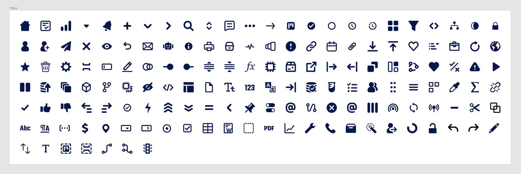
At Certa, our designer maintains over 150 SVG icons on a Figma board, with new ones coming every now and then. Previously we had to go through the following tedious and manual process of adding an icon from Figma to our React project:
- Exporting the icon as SVG format from Figma
- Creating a React component file and appropriately naming it
- Copying and pasting the SVG code into the component file
- Exposing props that parent component can pass (color, size, etc)
- Modifying SVG attributes (e.g. setting fill to currentColor)
- Clean unnecessary attributes
- Exporting the React icon component from the index file
This was a slow, repetitive, and error-prone process. Certainly, we could write some scripts here to automate much of the process. So we did. But first, let us explore why the above process can be a problem.
🔎 The Problem
Problem 1
Everyone has their own way of performing manual work. Not every developer on the team will follow a consistent way of performing the above steps.
Let us say Alice downloaded loader.svg icon from Figma and created a component called Spinner.tsx in the React project because that name seems to make sense to Alice. Bob comes along and is searching for the loader icon by searching for Loader.tsx file assuming that icons are probably named according to their names on Figma. But Bob doesn't find the icon, so he creates a new icon component name Loader.tsx from loader.svg.
Now we have two icon components named differently, but having the same code. This will lead to code duplication unknowingly, which is never good.
Problem 2
Another issue was that of inconsistent props of icon components. In some components, certain props ( e.g. color and size) were added, and in some, it wasn't. In some components, the default value of a prop (e.g. color) was set to a hex value and in others set to currentColor. This had led to unpredictable behavior when using icons and unexpected bugs started haunting the UI.
🚀 The Plan
Our frontend codebase is a monorepo housing various packages each having its own special purpose. One such package is called blocks (@certa/blocks). It houses the design system/building block components of our application UI such as the button, menu, tooptip, etc. Previously it housed the icons too, but it didn't quite feel like the right home for it.
The proposed idea was to create a new package (@certa/icons) in the monorepo specifically catering to icons and automating as much of the icon component generation process as possible.
Maybe not all the icons you need in your project are on Figma. Not a problem, we can also load SVGs icons into the script from a specific folder as an additional source.
The new package would contain a script that would:
- Fetch SVG icons from Figma
- Load SVG icons added manually into a specific folder as an additional source
- Clean and optimize the SVG code
- Generate React components for each icon which expose common props with the same defaults
- Create an index file that exports all the icon components
🧑💻 The Script
Here is a CodeSandbox for you to view the source code and run it yourself:
The script has been implemented using Node.js with TypeScript and it will make use of the following libraries:
- figma-api-exporter - for fetching icons data from Figma
- @svgr/core - transforming SVG code into React components
- ts-node - enables executing TypeScript on Node.js without precompiling
- fs-extra - adds file system methods that aren't included in the native
fsmodule - axios - for downloading SVGs from Figma
- dotenv - loading environment variables into the script
- chalk - printing colored output to the terminal
Firstly, we need to install the required libraries:
yarn add react figma-api-exporter fs-extra axios dotenv @svgr/core@5.5.0 @svgr/plugin-prettier@5.5.0 @svgr/plugin-svgo@5.5.0 chalk@4.1.2

yarn add --dev typescript ts-node @types/react @types/node @types/fs-extra
Folder Structure
We'll be using the directory structure given below to organize our code:
icons-generator/
├─ src/
│  ├─ icons/
│  │  ├─ components/ (all generated React icon components)
│  │  │  ├─ Bell.tsx
│  │  │  ├─ Gear.tsx
│  │  │  ├─ Home.tsx
│  │  ├─ svgs/ (manually added SVGs)
│  │  │  ├─ Gear.svg
│  │  ├─ index.tsx
│  ├─ templates/
│  ├─ generate.ts
│  ├─ types.ts
│  ├─ utils.ts
│  ├─ index.tsx
├─ .env
├─ svgr.config.js
├─ package.json
src/generate.ts file is the primary script where a majority of our logic would be.
svgr.config.js is the SVGR library configuration file
src/icons/components/ will contain all our generated react component files
src/icons/svgs/ contains SVG files that are not in Figma but also need to be converted to React components.
src/icons/index.tsx index file that exports all icon react components from components/ directory
Setup
The first step in the script would be to fetch the metadata of icons from Figma. The metadata will contain S3 URLs of all the icons which can be used to download their corresponding SVG code. We will use figma-api-exporter for this purpose.
To use this library, we would need to set up our Figma Personal Access token that the library can use to access our Figma account. Secondly, we need the Figma file id of the Figma board containing the icons. And lastly, the canvas name is required to locate the icons.
Getting Figma Personal Access Token, File ID, and Canvas
Go to your Figma dashboard and open Settings from the top right dropdown menu.
Scroll down to the "Personal access tokens" section and create an API token. Keep the API token handy, we'll be adding it to the
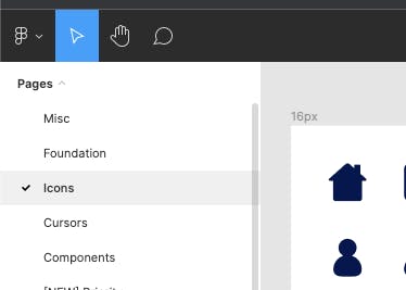
.envfile soon.Now to get the canvas name, look at the sidebar on Figma. The canvas is the name of the page on a Figma board where you kept the icons. In my case, the canvas is named "Icons".
One more thing we need is the Figma file id. Go to the Figma board where your icons reside. Look for the file id in the URL, it'll be the 12 character alphanumeric text.
https://www.figma.com/file/atT09besy7MsrjeyUsJLfP/Example-BoardAnyone who has your personal access token can get full access to your Figma account. It is best to save these values to a
.envfile so that we don't accidentally commit these values to version control. In the.envfile, add the API token and the file id as key-value pairs.FIGMA_API_TOKEN=<YOUR_FIGMA_API_TOKEN> FIGMA_FILE_ID=<FIGMA_FILE_ID> FIGMA_CANVAS=IconsOpen the package.json file and add the following entry in the scripts section:
"icons": "ts-node ./src/scripts/generate.ts",Now we can just use the
yarn iconscommand to run the script.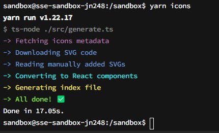
Code
Enough talk, let's dive into the code.
Firstly, we load the environment variables.
 // generate.ts

 // Loads environment variables from .env
 dotenv.config();

 // 1. Retrieve Figma Access Token, File ID and Canvas from .env file
 const FIGMA_API_TOKEN = process.env.FIGMA_API_TOKEN;
 const FIGMA_FILE_ID = process.env.FIGMA_FILE_ID;
 const FIGMA_CANVAS = process.env.FIGMA_CANVAS;
Then we use figma-api-exporter library to fetch metadata about the icons from Figma, providing it with the token, file id and canvas name.
 // 2. Fetch icons metadata from Figma

 // generate.ts
 const exporter = figmaApiExporter(FIGMA_API_TOKEN);
 exporter
   .getSvgs({
     fileId: FIGMA_FILE_ID,
     canvas: FIGMA_CANVAS
   })
   .then(async svgsData => {
     console.log('SVGs DATA:', svgsData);
   })
   .catch((err: unknown) => {
     process.exit(1);
   });
The console.log would output the following object structure:
 {
     "svgs": [
         {
             id: "1:43",
             url: "https://s3-us-west-2.amazonaws.com/...",
             name: "House"
         },
         {
             id: "2:86",
             url: "https://s3-us-west-2.amazonaws.com/...",
             name: "Chevron down"
         },
         ...
     ],
     "lastModified": "2021-11-30T19:19:08Z"
 }
The most interesting properties here are
urlandname.We can use the
urlproperty of each icon to download the SVG code using the axios library. A simple get request will do the trick.// utils.ts export const downloadSVGsData = async <T extends {}>( data: ({ url: string } & T)[] ) => { return Promise.all( data.map(async dataItem => { const downloadedSvg = await axios.get<string>(dataItem.url); return { ...dataItem, data: downloadedSvg.data }; }) ); }; // generate.ts // 3. Download SVG files from Figma const downloadedSVGsData = await downloadSVGsData(svgsData.svgs);Not all your icons might be in Figma. Having a second source for adding SVG icons would be great to have. So next, we can load the manually added SVG files located in
src/icons/svgs/and combine them with the ones downloaded from Figma into a single array namedallSvgs. Thefs.readdirSyncwould come in handy, allowing us to retrieve files in a certain directory.// generate.ts // 4. Read manually added SVGs data let manuallyAddedSvgs: { data: string; name: string }[] = []; const svgFiles = fs .readdirSync(SVG_DIRECTORY_PATH) // Filter out hidden files (e.g. .DS_STORE) .filter((item) => !/(^|\/)\.[^/.]/g.test(item)); svgFiles.forEach((fileName) => { const svgData = fs.readFileSync( path.resolve(SVG_DIRECTORY_PATH, fileName), "utf-8" ); manuallyAddedSvgs.push({ data: svgData, name: toPascalCase(fileName.replace(/svg/i, "")) }); }); const allSVGs = [...downloadedSVGsData, ...manuallyAddedSvgs];Once we have all the SVG code, it is time to convert them into React components and write the files to the
src/icons/components/directory.// generate.ts // 5. Convert SVG to React Components allSVGs.forEach(svg => { const svgCode = svg.data; const componentName = toPascalCase(svg.name); const componentFileName = `${componentName}.tsx`; // Converts SVG code into React code using SVGR library const componentCode = svgr.sync(svgCode, svgrConfig, { componentName }); // 6. Write generated component to file system fs.outputFileSync( path.resolve(ICONS_DIRECTORY_PATH, componentFileName), componentCode ); });The
svgr.syncfunction is performing some magic here, converting SVG code to React component. We will dive deeper into how it works in a later section.After the React components are created, the process of generating an index file can begin. The index file would export all the React components, so they can be used outside our current package. Have to say, the final generated index file looks oddly satisfying. 😄
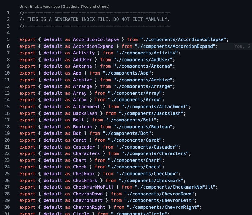
 // utils.ts
 export const createIndex = ({
   componentsDirectoryPath,
   indexDirectoryPath,
   indexFileName
 }: IndexConfigProps) => {
   let indexContent = "";
   fs.readdirSync(componentsDirectoryPath).forEach(componentFileName => {
     // Convert name to pascal case
     const componentName = toPascalCase(
       componentFileName.substr(0, componentFileName.indexOf(".")) ||
         componentFileName
     );

     // Compute relative path from index file to component file
     const relativePathToComponent = path.relative(
       indexDirectoryPath,
       path.resolve(componentsDirectoryPath, componentName)
     );

     // Export statement
     const componentExport = `export { default as ${componentName} } from "./${relativePathToComponent}";`;

     indexContent += componentExport + os.EOL;
   });

     // Write the content to file system
   fs.writeFileSync(path.resolve(indexDirectoryPath, indexFileName), indexContent);
 };

 // generate.ts
 // 7. Generate index.ts
 createIndex({
   componentsDirectoryPath: ICONS_DIRECTORY_PATH,
   indexDirectoryPath: INDEX_DIRECTORY_PATH,
   indexFileName: "index.tsx"
 });
The above function is simply looping over all the icon components, converting the filename to a component name, computing the relative path of the component file, forming an export style string, and concatenating it to a string that then gets written to the
index.tsxfile.
⚙️ SVG to React Components
When it comes to raw SVG to React conversion, the SVGR library gets the job done. It provides additional plugins like SVGO that are able to shave off some excess SVG styling and help with size reduction.
I provided SVGR with a config where I customized the output React component code as per my requirements. The svgProps property is used to set the SVG attribute values. replaceAttrValues will replace an existing attribute value with a new one, very useful for changing a hexcode color for fill attribute to currentColor which essentially tells the SVG to inherit the color property value from a parent element.
// svgr.config.js
const componentTemplate = require("./src/templates/componentTemplate");

module.exports = {
  typescript: true,
  icon: true,
  svgProps: {
    width: "inherit",
    height: "inherit"
  },
  replaceAttrValues: {
    "#00164E": "currentColor"
  },
  plugins: [
    // Clean SVG files using SVGO
    "@svgr/plugin-svgo",
    // Generate JSX
    "@svgr/plugin-jsx",
    // Format the result using Prettier
    "@svgr/plugin-prettier"
  ],
  svgoConfig: {},
  template: componentTemplate
};
This is cool and all, but you might be wondering how we can customize the React component code that SVGR pushes out. Here is where templates come in. SVGR allows us to pass it a template function that is internally executed by the babel plugin babel-plugin-transform-svg-component and expects Babel AST (Abstract Syntax Tree) to be returned from the function.
AST is essentially a tree representation of program source code, and in our case represents the React component source code.
// componentTemplate.js
function componentTemplate(
  { template },
  opts,
  { imports, componentName, props, jsx, exports }
) {
  const code = `
    %%NEWLINE%%
    %%NEWLINE%%

    import * as React from 'react';
    import { IconProps } from '../../types';
    import { IconWrapper } from '../IconWrapper';

    %%NEWLINE%%

    const %%COMPONENT_NAME%% = (allProps: IconProps) => {
      const { svgProps: props, ...restProps } = allProps;
      return <IconWrapper icon={%%JSX%%} {...restProps} />
    };

    %%EXPORTS%%
  `;

  const mapping = {
    COMPONENT_NAME: componentName,
    JSX: jsx,
    EXPORTS: exports,
    NEWLINE: "\n"
  };

  /**
   * API Docs: https://babeljs.io/docs/en/babel-template#api
   */
  const typeScriptTpl = template(code, {
    plugins: ["jsx", "typescript"],
    preserveComments: true,
    syntacticPlaceholders: true
  });

  return typeScriptTpl(mapping);
}

module.exports = componentTemplate;
The template API from @babel/template is provided as part of the props. It is responsible for converting our code from a string format to AST format. We pass the mappings to the placeholders in our code when invoking the function returned by the template function.
If you've noticed, in the custom template we have an IconWrapper component that gets passed the SVG code via props. The SVG code is rendered between a span. The wrapper has the benefit of being able to modify the props' behavior in one place as opposed to keeping the logic in each generated React component.
// IconWrapper.tsx
import * as React from "react";
import { IconProps } from "../types";

export const IconWrapper: React.FC<{ icon: React.ReactNode } & IconProps> = ({
  icon,
  color: colorProp,
  size: sizeProp,
  autoSize,
  ...restProps
}) => {
  const color = colorProp ? colorProp : "currentColor";
  const size = sizeProp ? `${sizeProp}px` : autoSize ? "1em" : "16px";
  return (
    <span
      role="img"
      aria-hidden="true"
      style={{
        color: color,
        width: size,
        height: size,
        display: "inline-flex",
        fontSize: "inherit"
      }}
      {...restProps}
    >
      {icon}
    </span>
  );
};
🎨 Make it Pretty
Once the script is ready, you can improve it by adding error handling and descriptive messages. We at Certa have also abstracted away a lot of dynamic values like the index file directory, index file name, icons component directory, etc. into a separate config file to be able to easily configure changes.
If you love good design like me, you might want to use additional libraries like ora and chalk to make the developer experience awesome while waiting for the icons to be generated. Ora is what adds the cool-looking spinners to the terminal while something is loading and Chalk allows you to bring the terminal to life with colors.
Look how beautiful the final CLI tool looks:
👋 Final Words
It seems like a lot of work to get the script set up, but once it works, you gain complete control over your icons. Plus it saves a ton of time and makes your code more reliable.